
Next WaveDigital & Consulting
Book a consult

Case studies

What we made, and why it looks like that.

Two engagements broken down by deliverable rather than by client story. Same process, deliberately opposite outcomes — one had to shout through a snowstorm, the other had to whisper like a travel magazine.

Case study 01
01
Seasonal home service · Westford, Massachusetts

Plow King MA

Hired to build a company out of a truck and a reputation. Everything below was made from scratch — there was no existing name, mark, artwork or website to work from.

NamingIdentityMascotPrintOffer designWebsiteLocal SEOWorkflow
NamingCompany name, short mark, tagline
IdentityCrown mark, badge lockup, favicon
PaletteFive colors with usage rules
TypeTwo families, full scale
MascotCharacter sheet, six poses
PrintDoor hanger, flyer, letter, card
OfferGroup-rate mechanic, density model
Website16 town pages, quote flow
WorkflowInbox, routing, reply templates
LaunchDomain, hosting, SSL, profile
01

The consultation

One sixty-minute call produced the three facts the entire project was built on. They had been plowing since 1990. They were only profitable when driveways clustered on the same street. And everything they owned commercially was a phone number sitting in people’s contacts, which disappeared the moment a customer moved away.

We scoped a single engagement covering naming, identity, print, web and lead handling, and quoted it as one fixed number rather than five line items they would have to choose between.

Scoped in the callDecision
Residential vs. commercialResidential first
Pricing postureMatch going rate
Territory16 towns
Profitability driverRoute density
EngagementOne fixed price
Commercial deferred after reviewing insurance requirements
02

Naming, from nothing

We wrote and screened a candidate list, starting where most family businesses start — the surname. Cusano Snow Co. was designed, presented internally and killed by us before the client ever had to react to it. It was accurate and completely forgettable, it made the customer remember a spelling, and it gave an illustrator nothing to draw.

We changed direction to a category-claim name. Plow King of Massachusetts asserts rank instead of describing a service, carries state pride that a national franchise structurally cannot use, and hands the identity an object to build on. Shortened to MA Plow King for signage, handles and anywhere the full name would not fit.

  • TESTCan a neighbor repeat it after hearing it once?
  • TESTDoes it survive being shouted across a driveway?
  • TESTIs there a mark hiding inside the name?
  • TESTDoes the .com exist and read cleanly?

Domain secured at plowkingma.com, and a dedicated business inbox created in the brand name rather than a personal address.

03

The identity system

Drawn from scratch. A five-point crown built to survive the two sizes that actually matter: a truck door at fifty feet, and a 16-pixel browser tab. The palette comes out of the working environment rather than a trend deck — storm navy, plow-blade chrome, and a red borrowed from emergency lighting. Type is a heavy grotesk that stays legible through road spray, paired with a mono face carrying every number the business sells on.

Palette
Nor’easter#12304A
Slate night#0B2137
Blade chrome#C9D3DA
Beacon red#C8202E
Crown brass#E8C563
Typography
The King always shows up. Display — heavy grotesk, tight tracking 978·888·3888   16 TOWNS Utility — mono for numbers, towns, prices
Rule

Red is reserved for actions only. If it is red, it can be clicked or called.

Delivered as SVG, PNG, PDF and embroidery-ready vector, with a one-page usage guide covering minimum size, clear space, the two approved reversals, and the rule that red never appears except on something clickable or callable.

04

The mascot & character system

A crown is a mark. A king is a character — and a character can do things a mark cannot: point at a phone number, hold a shovel, lean out of a truck window, vouch for the work. We drew a full character sheet so the brand has a cast rather than a logo, and every piece of collateral pulls from the same set.
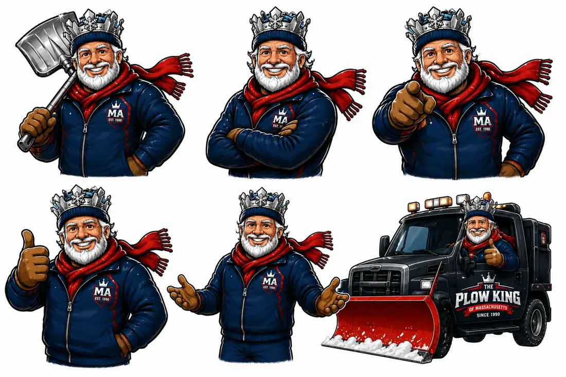
Character sheet for the Plow King mascot: six poses of a bearded king in a navy jacket, ice crown and red scarf, plus a plow truck application
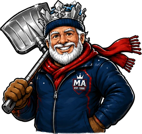
Mascot holding a snow shovel
Shovel — print & hanger
Mascot with arms crossed
Arms crossed — about page
Mascot pointing at the viewer
Pointing — calls to action

Each pose has an assigned job, documented in the usage guide. Pointing goes next to anything you want clicked or called. Arms crossed carries credibility copy. The shovel pose belongs on print, where the silhouette has to read from a doorstep.

The truck application matters most: it is the only piece of this brand that drives past a thousand houses during a storm. The mascot, the crown badge and “since 1990” all resolve at speed, in the dark, through falling snow.

05

The print system

Four pieces designed as one system, each with a different job and a different distribution method. The door hanger is the piece that does the real work: its headline is a fact rather than a pitch, and it is only ever hung on streets where a contract already exists — which turns every signed customer into distribution for the next one.

WESTFORD · SINCE 1990
We already plow your neighbor.
Two doors down, all winter. Add your driveway and the truck is already on the street.
5+ HOMES SAVE 15% EACH
978-888-3888

Door hanger — street-targeted

RESIDENTIAL & COMMERCIAL
Rule the snow.
Seasonal contracts and per-storm rates across sixteen Massachusetts towns. Priced to the going rate — the discount is for your street.
NEIGHBORHOOD GROUP RATE
plowkingma.com

Flyer — shared mail & EDDM

PLOW KING
Snow removal · Westford, MA
978-888-3888
plowkingma.com

Card — navy face

The flyer carries the group rate and goes out through shared mail for cheap broad awareness; targeted EDDM covers the specific streets the route wants. A letter version handles the small number of addresses worth a personal approach.

06

The offer, designed before the artwork

We modeled the route before designing a single piece. The second driveway on a street is worth dramatically more than the first, because the truck is already parked there — so the campaign was built to produce clusters, not leads.

That set a density target of fifteen to twenty homes per neighborhood, and produced the mechanic that appears on every piece of collateral: five or more homes on one street and each of them saves fifteen percent. The discount is smaller than the drive time it removes, which is the only reason it works.

Base pricing matches the local going rate rather than undercutting it. The differentiator is the neighborhood offer, not being cheap.

Offer modelValue
Target homes per street15–20
Group threshold5 homes
Discount per home−15%
Base price postureMarket rate
Referral cost$0
Existing customers recruit the street; drive time pays for the discount
07

The website

plowkingma.com
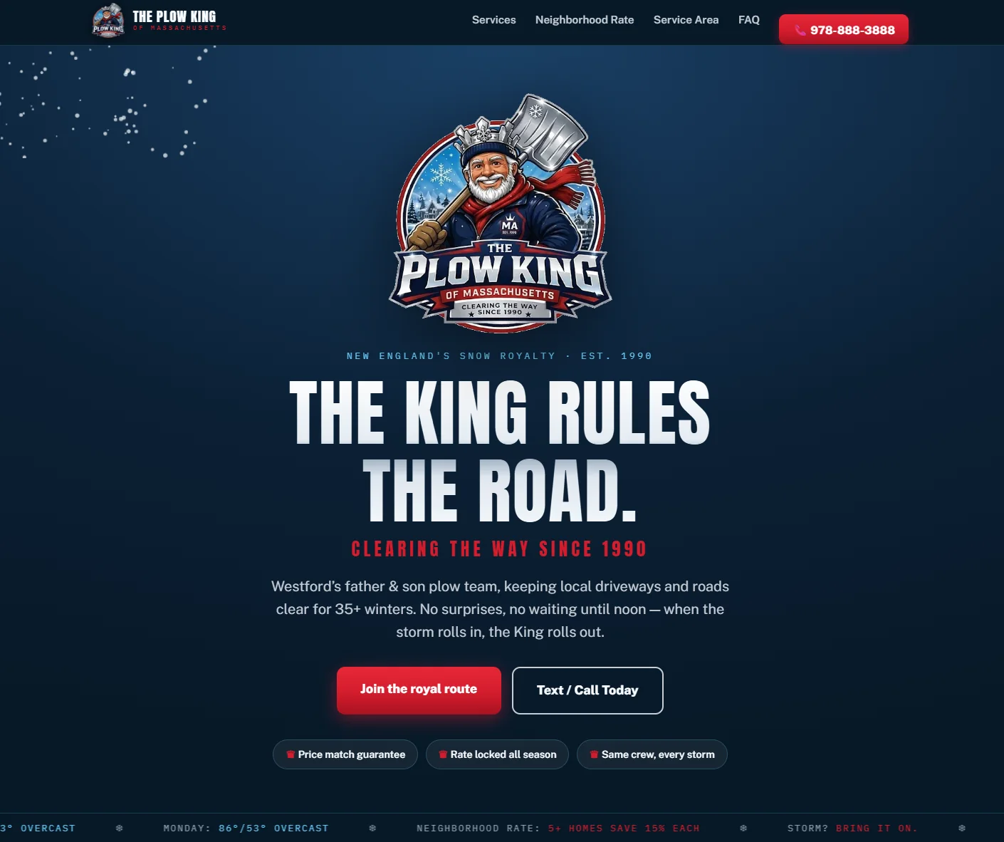
The Plow King of Massachusetts homepage: dark navy hero, mascot crest and a red call to action
Homepage and mobile view. One action per screen, phone number persistent, residential and commercial split at the top level. Visit the live site

Architecture built for how people search rather than for how the company is organized: a page per town across sixteen municipalities, each written for the phrases a homeowner types at five in the morning. Residential and commercial split at the top so nobody reads the wrong page, with routes reserved for ice management and salting so the next service line does not require a rebuild.

Hand-built responsive front end, LocalBusiness schema, quote forms wired to a real inbox, analytics and conversion tracking. Designed at 375 pixels first, because the person deciding is standing outside looking at snow.

08

The workflow behind it

A brand and a website generate enquiries. Something has to catch them, or the whole spend leaks out the bottom. We built the handling path as a deliverable in its own right — inbox, routing, templates and sequence — so nothing depends on someone remembering to follow up during a storm.

The density check is deliberately manual. It is the one decision in the chain that should stay with the operator, because it is the one that determines whether the job makes money.

01Door hanger or local searchHomeowner lands on their own town page
02Quote form captures the detailsAddress, driveway size, service type, contact
03Instant acknowledgement sendsSets the response expectation, surfaces the group rate
04Operator checks street densityIs this road already on the route? Human decision, always
05Quote goes out from a templatePriced to the going rate, group discount applied if it qualifies
06Contract and season scheduleCustomer joins the cluster; the street becomes a hanger target
09

Launch and handoff

Domain purchased in the client’s own name, deployed to Netlify, SSL issued, forms tested live rather than assumed working. Google Business Profile built and categorized for seasonal search behavior, with the service area matching the sixteen towns on the site.

Every credential transferred with a written walkthrough. The client can change a price, a phone number or a town list without calling us — and can take the entire thing to another provider tomorrow if they want to.

  • 01A complete brand where there had been none — name, mark, palette, type, and a usage guide, applied identically across truck, hanger, flyer, letter, email and web.
  • 02A four-piece print system whose distribution logic is built into the artwork, not decided afterwards.
  • 03A live site the client owns outright, with working quote capture and a structure that supports commercial, salting and ice management without a redesign.
  • 04A campaign engineered for route profitability rather than lead volume — every additional street costs less to serve than the last.
Plow King mascot pointing at the viewer

The pointing pose earns its keep here.

It appears beside the quote button on the site, on the door hanger, and at the end of every email. One drawing, doing a job that a logo cannot do.

Case study 02
02
Travel & digital commerce · Italy

Italy Travel Finds

The opposite problem, and deliberately the opposite design language. This brand already had 55,000 people. What it did not have was anywhere of its own to send them.

PositioningIdentityArchitectureProduct designPricingAffiliatePartnershipsBooking
PositioningCategory move, tagline, promise
IdentityRoute mark, palette, type system
Architecture13 destinations, page template
Product19 guide covers, merchandising
PricingRepricing model, volume trade
AffiliateTour and hotel infrastructure
PartnersInbound partner program page
BookingNative reservation flow
DeploymentStaged build, safe cutover
01

The brief

This engagement did not start with an audience problem. It started with an ownership problem: three years of work living inside one platform, monetized almost entirely by sending people somewhere else.

We scoped a full rebuild — positioning, identity, site architecture, product merchandising, affiliate infrastructure, a partner program and a booking flow — and staged it as a separate build so the live site kept earning untouched while the new one was reviewed.

ScopedDecision
PositionLuxury, year-round
Revenue streams3, independent
Destination pages13
Products migrated19 of 29
CutoverAfter approval
Ten Rome-specific products held back deliberately
02

Repositioning

The account had grown on finds and deals. That framing caps what you can sell, attracts price-led travelers, and makes partnerships with good operators harder to win. We moved the brand to a luxury position with a year-round global audience — the same content, aimed at a different buyer.

One promise carries it: discover the Italy locals love. It sets the brand against the guidebook default without claiming exclusivity it cannot deliver, and it gives every destination page, guide and partnership a single test to pass.

03

The identity system

Every competitor in this category uses travel blue. We went to the ground instead — cypress, sage, travertine, terracotta and antique gold, which is what the country actually looks like. The mark is a journey route rather than a landmark: a hand-drawn line from a departure point to a destination, which works for thirteen regions instead of illustrating one.

Palette
Cypress#5D7355
Sage#7C8B6B
Travertine#F0EADF
Terracotta#A8674A
Antique gold#C6A15B
Typography
Discover the Italy locals love Display — light weight, italic for emphasis 13 DESTINATIONS   19 GUIDES Utility — mono, wide tracking, uppercase
Rule

Gold marks value, never decoration. Terracotta never touches cypress without cream between them.

Note the deliberate distance from case study 01. Same studio, same process, opposite instruments: light display weights instead of heavy, italic emphasis instead of a red action color, generous space instead of urgency.

04

Site architecture

italytravelfinds.com
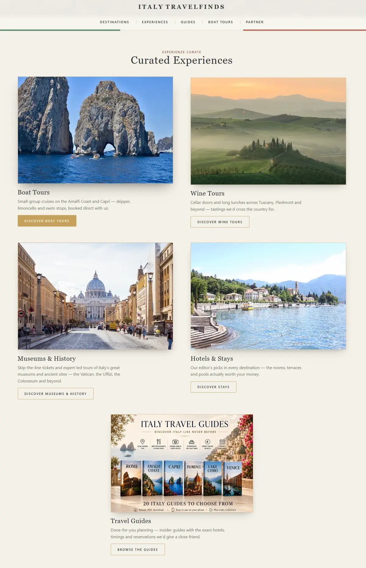
Italy Travel Finds curated experiences page: boat tours, wine tours, museums and hotels, plus the guide catalogue
Destination-led architecture. One template serving thirteen regions, each with its own film, guides, tours, stays and featured local. Visit the live site

Organized by where people want to go rather than by content type, because that is the only question a visitor actually arrives with. One destination template serves all thirteen regions: video hero, curated tours, hand-picked stays, the region’s guide, and a featured local partner.

A quiz block catches the large share of visitors who know they want Italy but not where in it — the highest-intent, worst-served segment on any travel site. Testimonials sit at the hesitation point rather than at the bottom of the page.

05

Product design and merchandising

Nineteen destination guides were sitting hidden on the old site. We designed a cover system so they read as a catalog rather than as files, then merchandised them onto the destination pages where the intent already exists.

ITALY TRAVEL FINDS
Amalfi Coast
THE COMPLETE INSIDER’S GUIDE

Guide cover

ITALY TRAVEL FINDS
Rome
THE COMPLETE INSIDER’S GUIDE

Guide cover

ITALY TRAVEL FINDS
Lake Como
THE COMPLETE INSIDER’S GUIDE

Guide cover

Repriced to $17 from $27 — a deliberate volume trade. A digital product has no marginal cost, and the audience is large enough that reach beats margin per unit. The strike-through does the rest.

Ten Rome-specific products were held back rather than migrated. Shipping a clean nineteen-guide catalog beats shipping twenty-nine with overlapping titles that make the buyer think.

06

Revenue infrastructure

The point of the rebuild was that no single stream can be switched off by someone else. Three run in parallel underneath every destination page, and a visitor who buys nothing can still earn through the third.

The booking flow was the hardest and most valuable piece: guests reserve the Amalfi Coast boat day inside the brand instead of being handed to a third-party checkout, which is exactly where trust and conversion normally break.

01Instagram or searchVisitor arrives on a destination page
02One region, everything in placeFilm, guide, tours, stays, featured local partner
03aGuide purchaseOwned product, no marginal cost, instant delivery
03bAffiliate tour or hotel bookingEarns even when nothing is bought directly
03cDirect partner bookingNative reservation flow, commission on the full value
04Operators apply inboundPartner page turns sourcing into an application queue
07

Deployment

Built as a separate site rather than edited in place, so the existing one kept earning throughout review. Nothing on the live domain changed until the new build was approved end to end.

Affiliate infrastructure was configured before launch rather than after, so the first day of traffic on the new site was already monetized on all three streams.

  • 01An established Amalfi Coast tour company grew revenue by roughly 50% in under a year through the partnership this work supports.
  • 02Revenue moved off a single rented platform onto owned infrastructure with three independent streams.
  • 03Nineteen products made visible and merchandised, with a cover system that scales as new destinations are added.
  • 04Partnerships became inbound — small Italian operators now apply, rather than being chased.

Same studio, same process, deliberately opposite results. The method is repeatable. The look never should be.Why these two sit side by side

Start with a conversation.

Thirty to sixty minutes, no charge, no pitch deck. You leave with a plan and a fixed-price proposal — whether or not you hire us.

Scheme